Bootstrap or Tailwind? A question many of us have asked when selecting a CSS framework. Even though we can’t declare a clear winner, one will likely suit your project better than the other. From the get-go, Bootstrap sports many advantages, primarily ready-made components, while Tailwind offers “just” more effective way to write styles in CSS.
But what if your project requires a more complex approach and Bootstrap’s components are no longer convenient? Many coders would need to hack or bend the default ones, which is often more challenging and time consuming than grabbing a component from a different library or writing it from scratch.
Thus, instead of half-measured fixes, we decided to transition to Tailwind.
And we immediately knew it was the right choice. Here are five reasons why:
1. Bootstrap has limited options 🎛
Let’s get this out of the way: Bootstrap’s limitations can make a coder’s life harder.
Its pre-made components will likely save you a ton of work, but only if you don’t tweak their appearance or behavior.
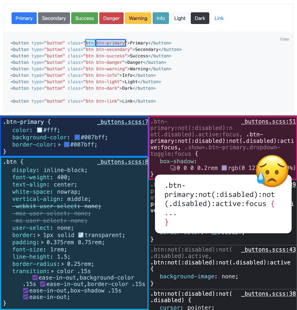
For instance, <button> has over 20 CSS rules for appearance and behavior in various interactive states, like :hover and :focus. What’s even better, we have these buttons in all necessary variants, such as the primary, secondary, danger, or success, out-of-the-box. It’s all handy until you start altering them.
CSS rules for the primary button in Bootstrap (Bootstrap, NetGlade)
In Tailwind, there are no pre-designed button styles. Instead, you can change appearance with dozens of predefined CSS utility classes, which can be faster in the long run. Styling interactive states with pseudo-classes is easy, too, mostly thanks to various prefixes, such as hover:bg-blue-700. In contrast, reworking states in Bootstrap can be strenuous and lengthy.
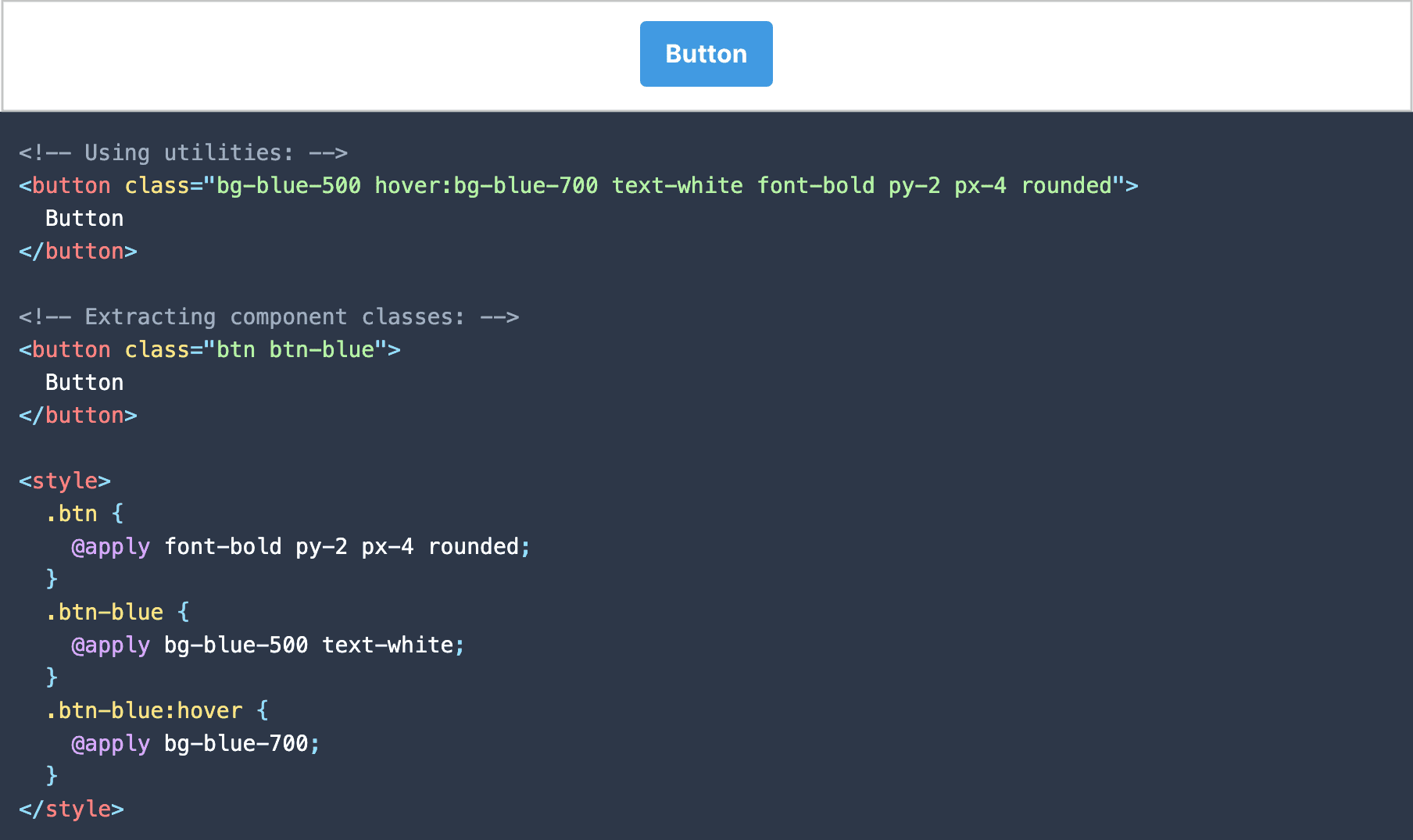
Styling a button with utility classes and component classes (Tailwind)
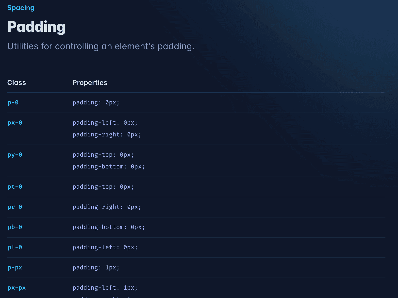
Bootstrap only offers a limited number of utility classes, which assign various properties such as width or background color. Tailwind, on the other hand, has 19 classes for padding size and these are available for all positions — top, bottom, left, right, and their combinations — 133 utility classes in total, and only for padding! Need an element with a fixed width? There are 36 classes available just for that!
Regarding spacing in Bootstrap, you’re limited to only 6 options. Need any other size? You’ll have write it yourself. The framework sets relative width based on the parent element and utilizes grids, columns, and breakpoints. There are no classes for fixed-width elements.
Still, it partially makes up for its lack of utility classes with simple implementation and good responsivity. But even that doesn’t go all the way.
If you’re coding a design from Figma and aiming for a 1:1 recreation, with Tailwind, you’ll be able to reach a pixel-perfect result. Its detailed documentation can be of great assistance, where you’ll likely find all applicable classes. Unfortunately, this is where Bootstrap leaves you hanging, and it’s up to you to create a custom class.
2. Tailwind has significantly better documentation 📚
In terms of documentation, Tailwind blows its competitor out of the water.
One of its brightest highlights is the search function: You enter a CSS property or class and are presented with a solution along with a set of examples. Naturally, Bootstrap also has a search function, but it proved much less effective in our experience. Even prompting for CSS properties or keywords such as “margin” can be a non-starter. You’ll have to search for “spacing” instead, the sparingly used term for the function.
Tailwind has many ready-made utility classes for the vast of majority of CSS rules. Its documentation is also excellent. (Tailwind)
3. Tailwind makes code cleaner 🧹
Having clean code is a must. With Tailwind, keeping it neat and tidy is more manageable, even when implementing more complex features. In addition, Tailwind excels at combining inline utility classes with other naming systems, such as BEM, or your custom CSS classes. Simply by using the @apply function, you can assign each CSS class a Tailwind utility class.
What exactly does it mean? If you want to add utility classes to an element, like flexbox or blue background, for example, you can write it directly in the HTML tag. But if you need even more, you can name the element .nav__item--active and add all necessary Tailwind classes in the CSS file or <style> section.
Bootstrap requires you to write all utility classes into HTML, and they’ll stack up on one element in no time. If you need styles or behavior that Bootstrap doesn’t provide by default, you need to come up with your own classes and their properties must be written in plain CSS or SCSS. While that may seem like nitpicking, it can quickly fragment your code, and creating your own utility classes isn’t a particularly elegant solution.
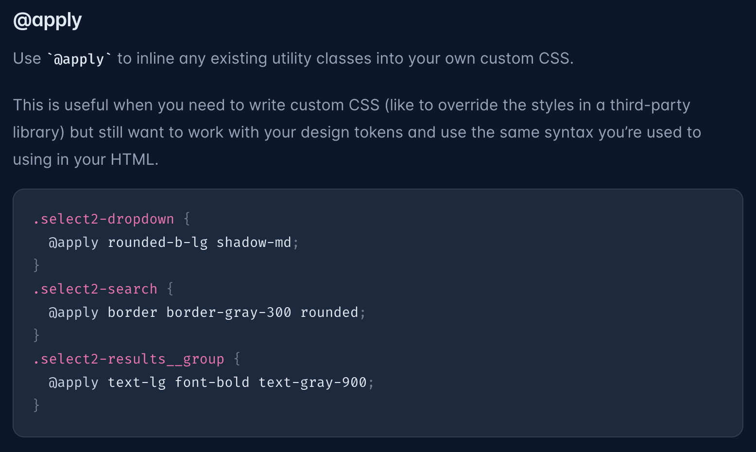
The correct use of @apply is often mentioned in relation to styling existing project libraries (Tailwind)
4. Tailwind rewards knowledge of frameworks 🧠
As we mentioned in the introduction, Bootstrap limits your options to pre-made components that will largely determine the overall technical and visual level of your website or app. If you learn how to write classes specifically for it, you’ll probably never use them anywhere else.
Tailwind lets you venture into various component libraries, such as Tailwind UI, Daisy UI, Windy UI, or Flowbite. All use of out-of-the-box components is entirely up to your imagination. And the cherry on top: Tailwinds optimised CSS files for production are smaller in size by only exporting those classes you actually use.👀
5. Tailwind’s bright future 🚀
The rise of *Tailwind in the last couple of years is a buzzy topic that led to a paradigm shift in Bootstrap’s long-standing dominance. While its reign as the most used framework continues, it’s by no means a fan favorite. According to, the popularity of Tailwind is rising sharply, and its users are reporting high levels of satisfaction. On the contrary, about 40% of CSS framework users refuse to use Bootstrap again after their previous experience. Only 8% feel the same about Tailwind.
In other words — once you cross, you won’t go back. And that's how we feel it as well.
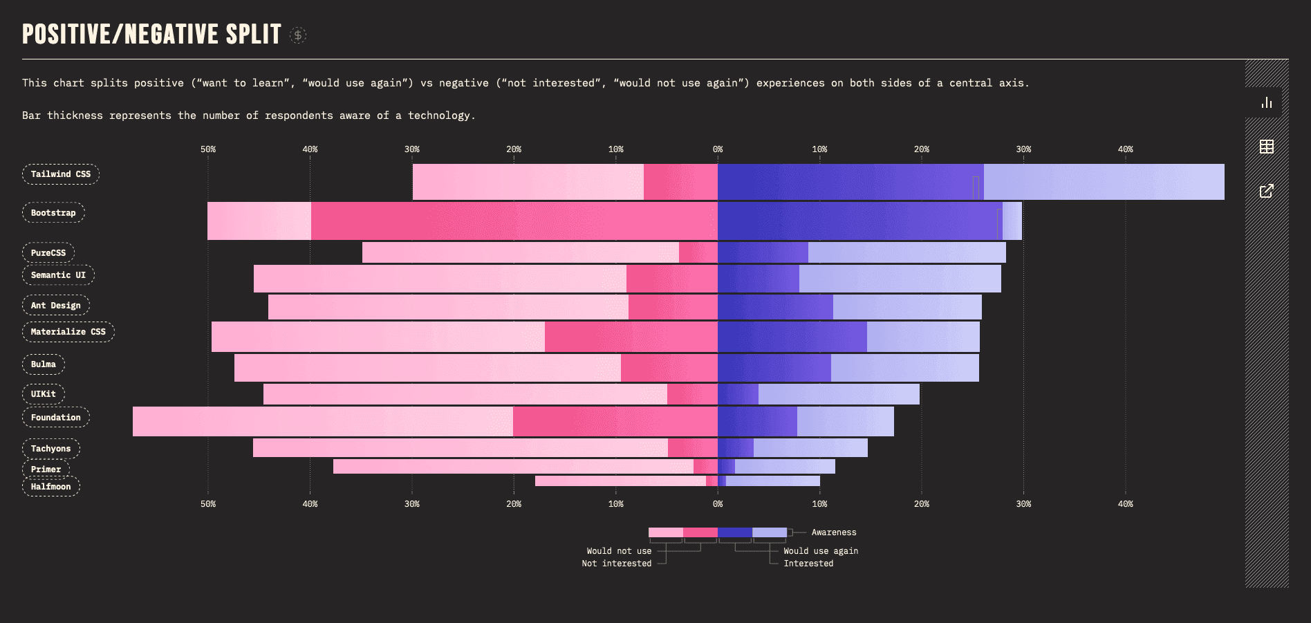
The split of positive and negative experiences using CSS frameworks (State of CSS)
Closing thoughts
Tailwind’s extensive flexibility and customizability are a joy for many designers and coders. But, of course, we’re not saying that Bootstrap should always get the boot — there’s still plenty to like: its simplicity, functionality, and responsivity. Ultimately, it’s up to each team to decide for themselves with their current project in mind. But everyone should be aware of potential risks associated with either framework.
And in our case, that’s where Tailwind perfectly suits our needs, ideally with open-source component library such as Daisy UI as its companion.
Sources
State of CSS 2021 - CSS Frameworks | State of CSS
Get started with Tailwind CSS | Tailwind
Get started with Bootstrap | Bootstrap
Daisy UI Components | Daisy UI
Tailwind CSS: 15 Component Libraries & UI Kits | stackdiary.com


